horta
A concept brand for a home herb-growing kit. The goal: make growing food at home feel like a playful habit, not a gardening chore.
Type
Brand
Year
2026
Role
Self-initiated concept
Scope
Logo, type, color, packaging, print, merch, motion

01
Context
A small garden for city homes
Most grow-at-home kits look either clinical, like a gadget, or rustic, like a market stall. horta takes the space in between: people in city apartments who have a windowsill rather than a garden, and want their first harvest to feel easy and a little joyful.
Thoughtful
Every element explains itself: what to sow, when to water, what comes next.
Tactile
Paper pulp, kraft and a pressed leaf on the lid. A kit you want to hold.
Beautifully simple
One mark, one leaf, one grid, carried across every touchpoint.


02
The mark
Growth you can read at any size
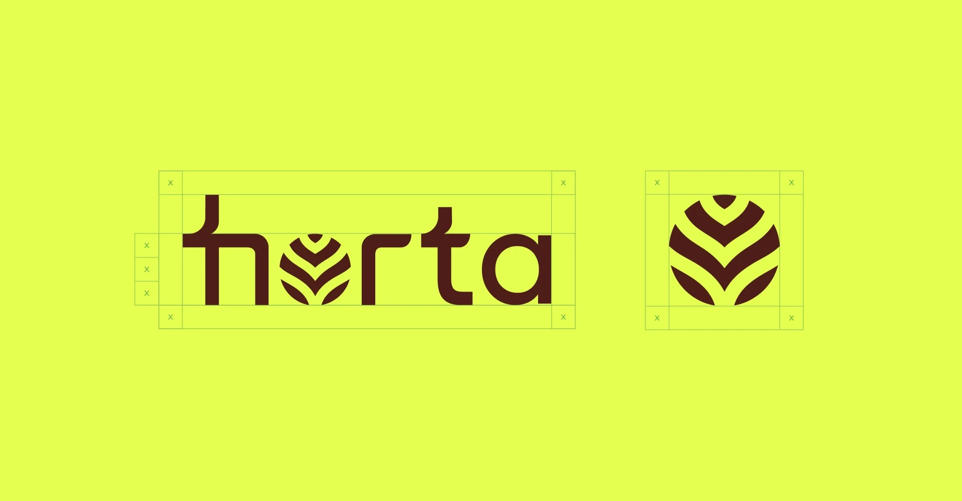
The “o” in horta became a leaf made of stacked chevrons rising from a single stem, so the name itself grows upward. Built from simple bands, it holds up as a full wordmark, as a stamp on a sticker and as an emboss on the box lid. The brand stays recognisable even when only a corner of it is visible.
03
Packaging system
One grid, every herb
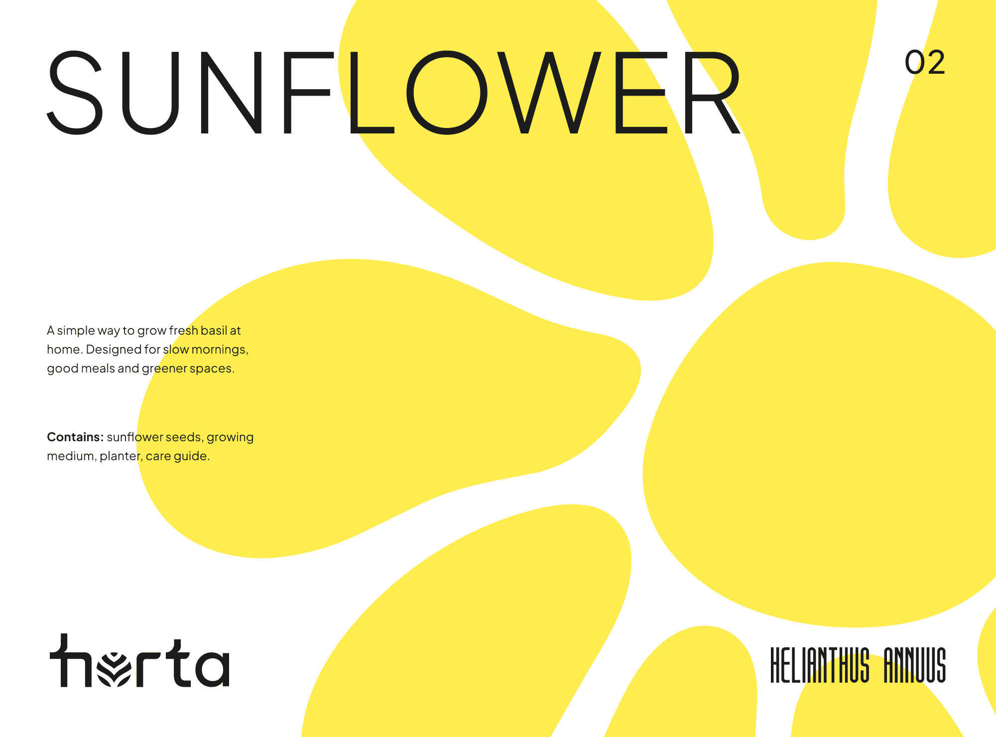
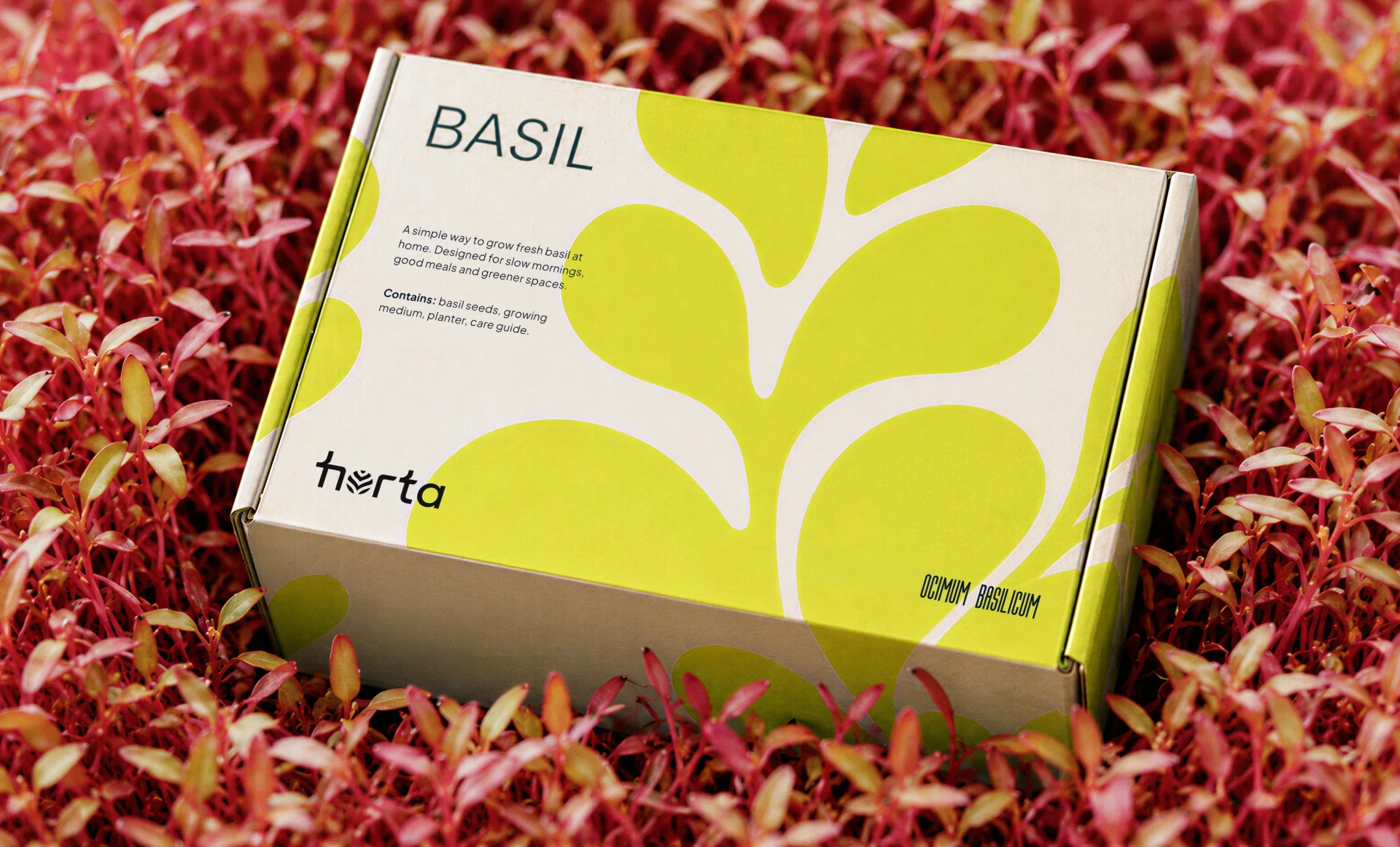
Every SKU shares one structure. The common name leads, the Latin name sits underneath as a quiet mark of authenticity, and a single oversized leaf carries the colour. Adding a new herb means changing three fields, not redesigning a box.


04
Colour & type
A palette pulled from the soil up
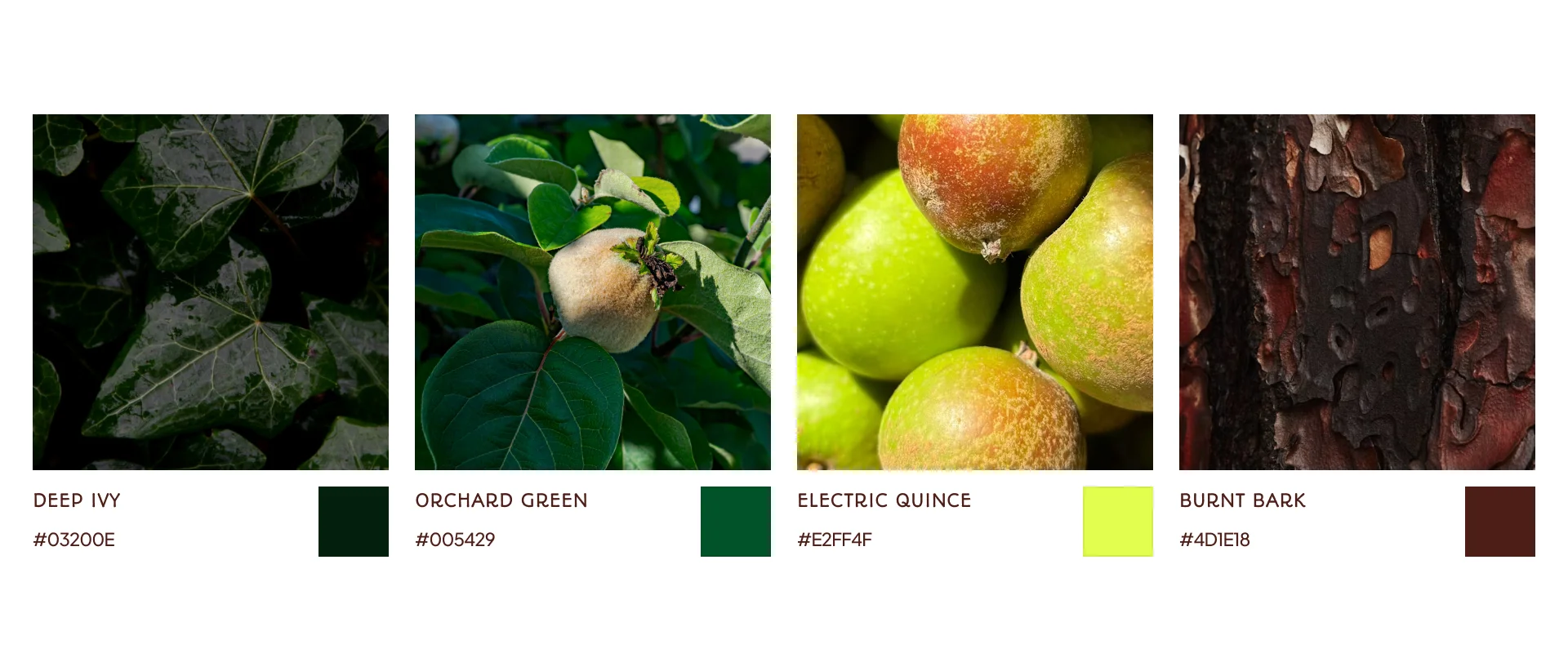
Deep Garden grounds every layout and carries the text. Fresh Leaf lime is saved for the moment something grows, so it never turns into noise. Warm Ivory keeps print feeling like paper rather than plastic. Type follows the same split: Plus Jakarta Sans explains, condensed Aurora shouts, mostly in Latin plant names, a playful nod to real botany.
05
Beyond the box
Turning one purchase
into a habit
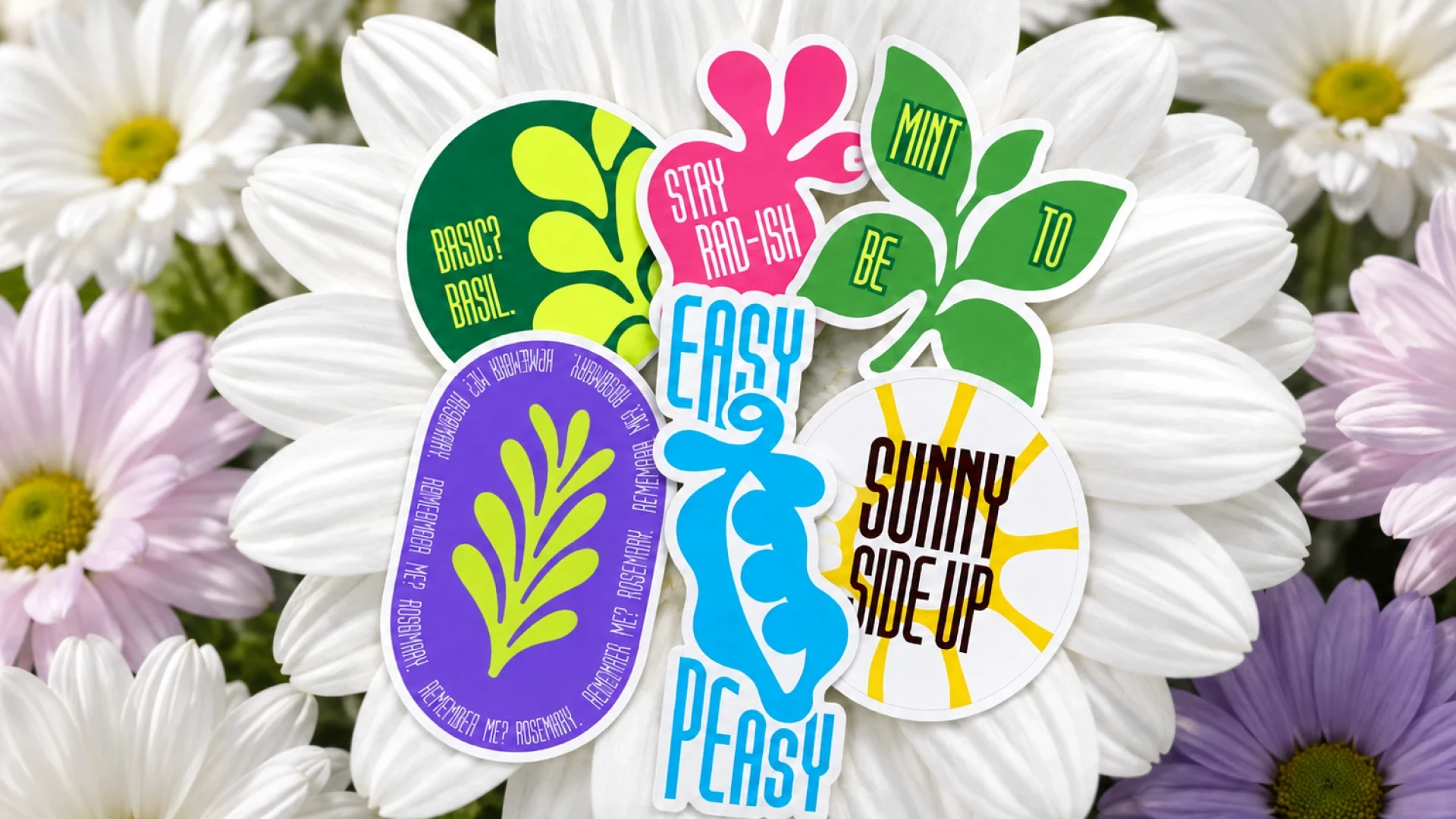
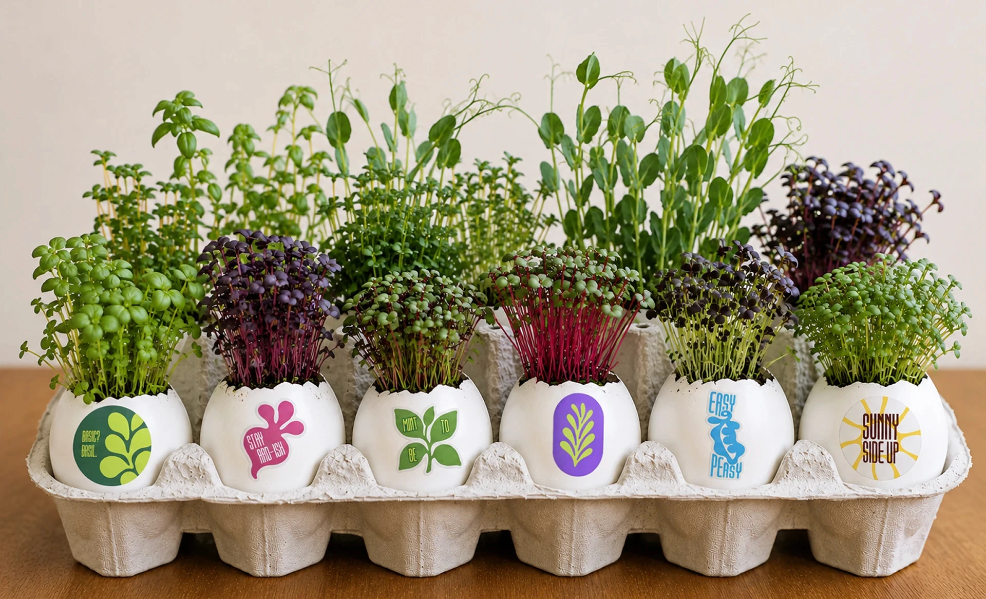
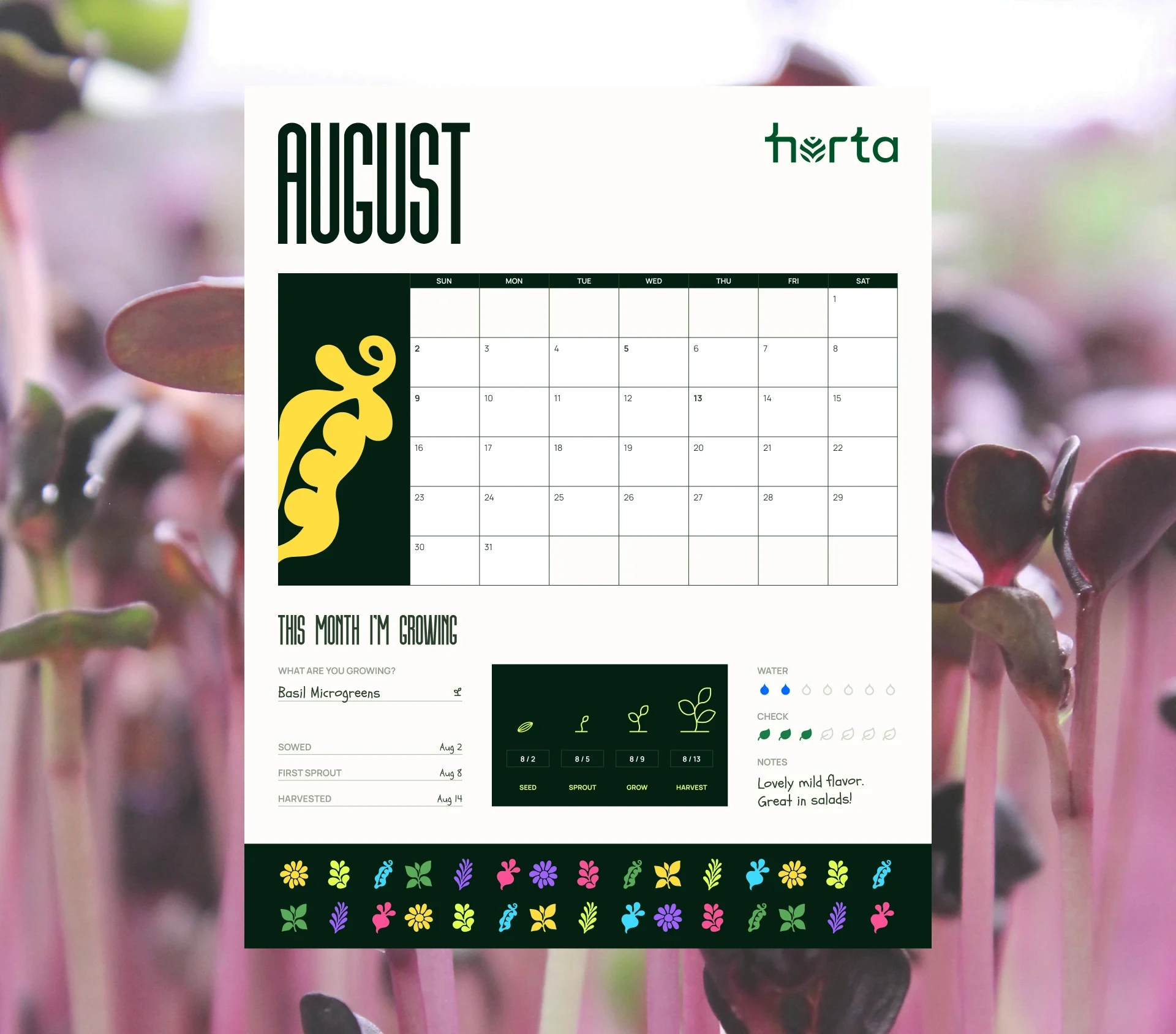
A kit is a one-off; a habit is a brand. Pun stickers make labelling pots fun, eggshell starters turn kitchen leftovers into the first pot, and a monthly growing calendar gives a reason to come back. Each touchpoint nudges the next small action.